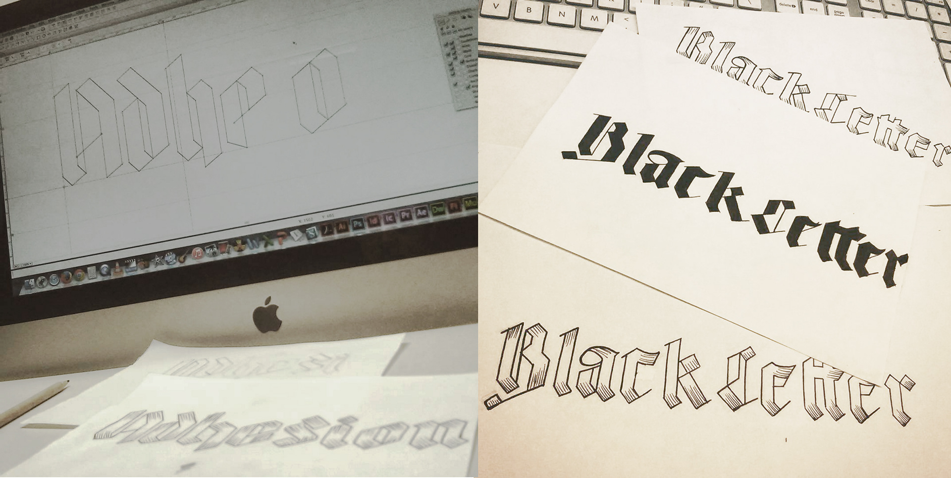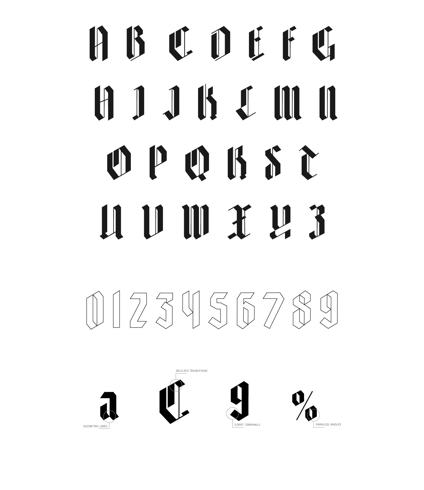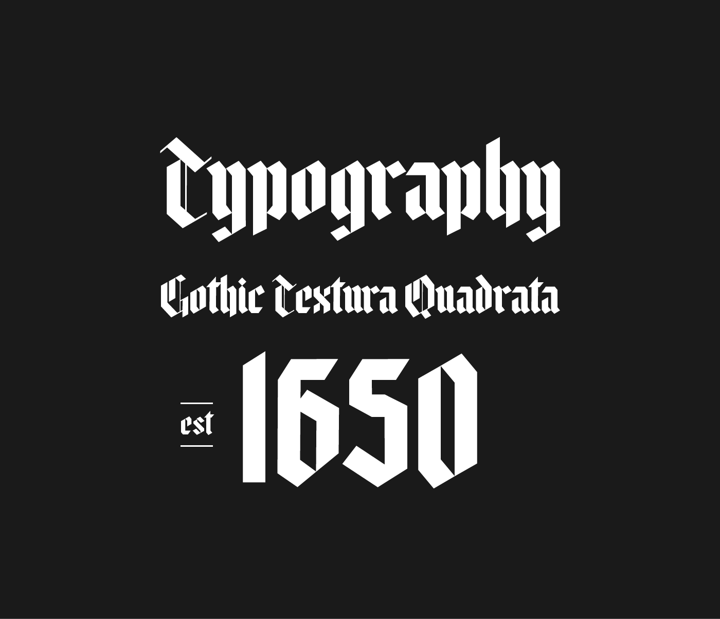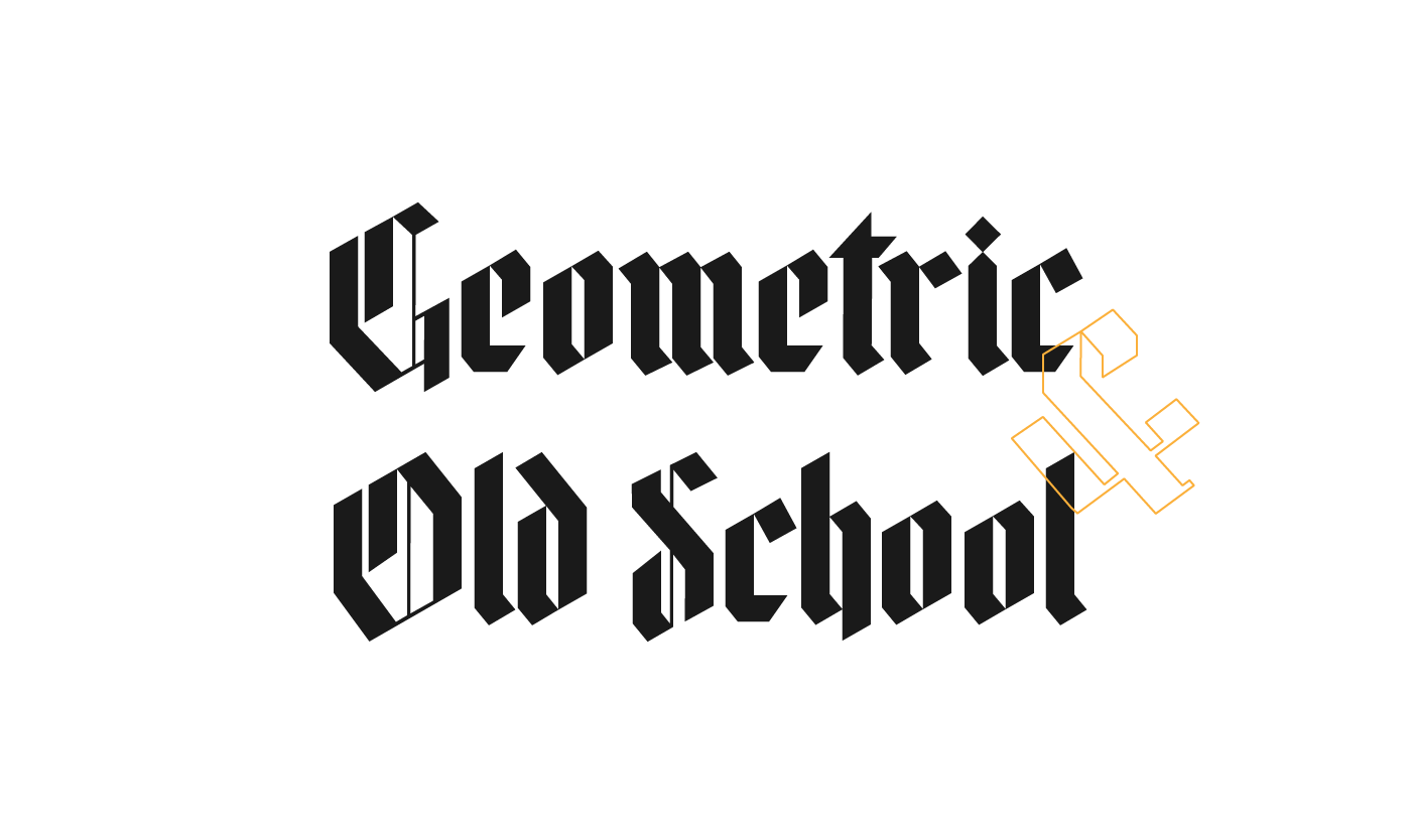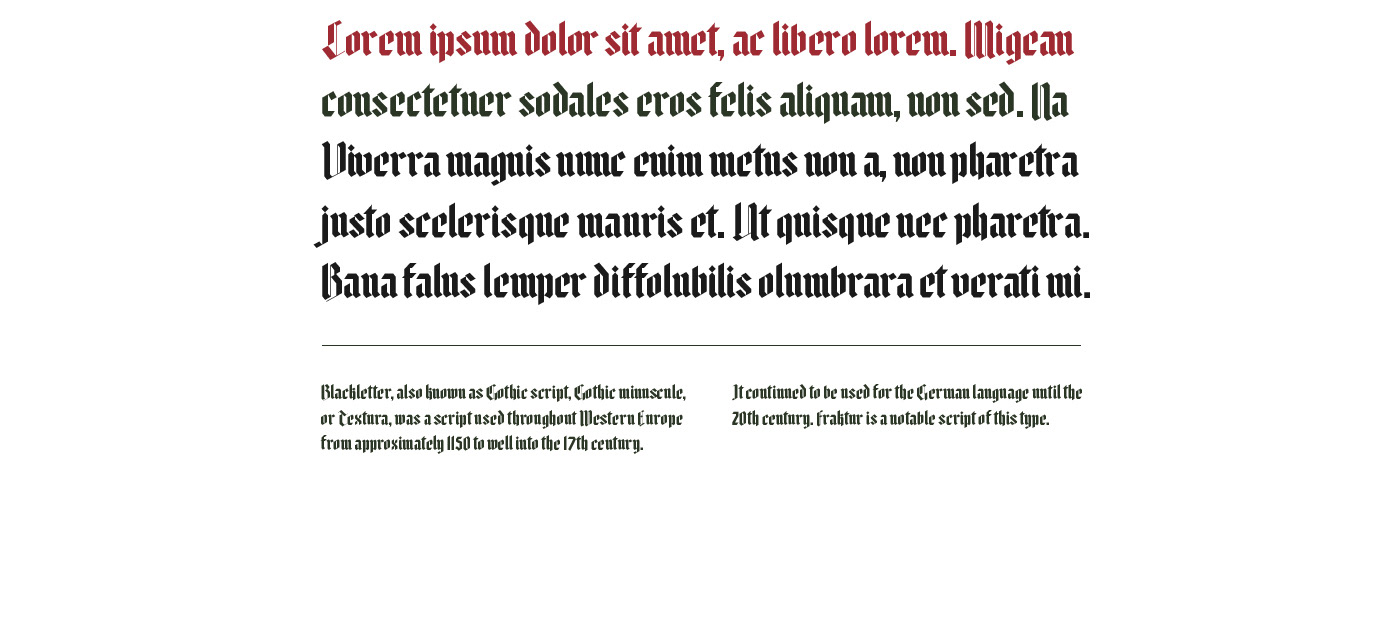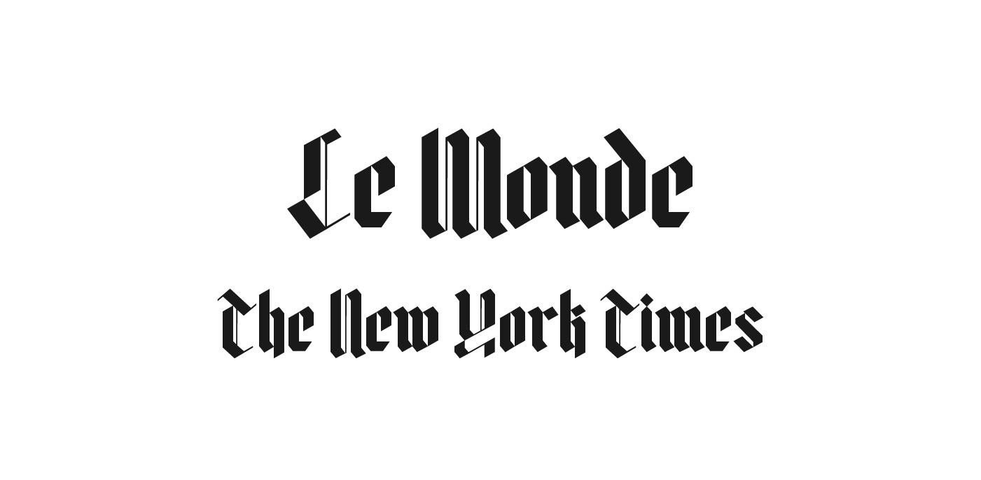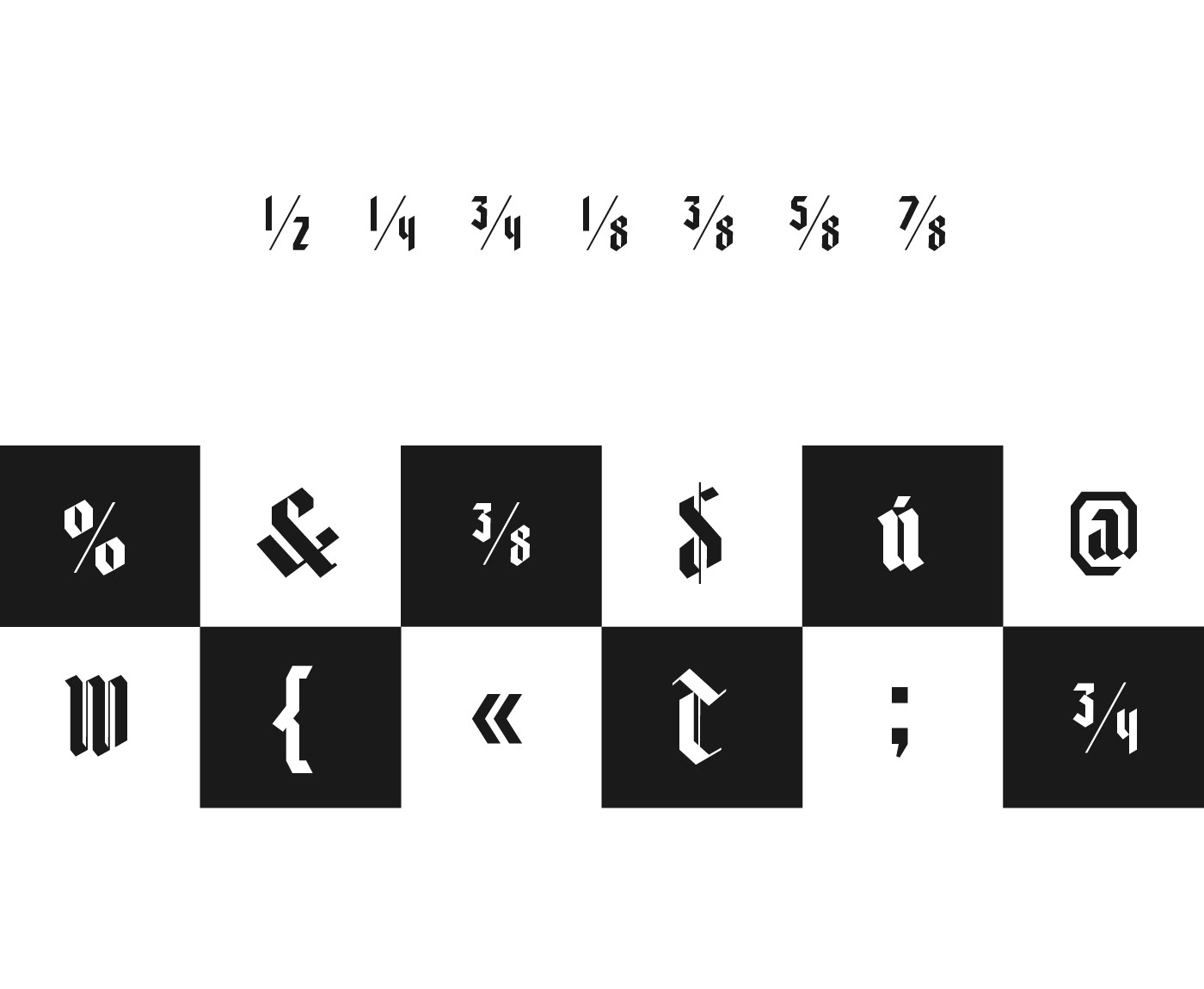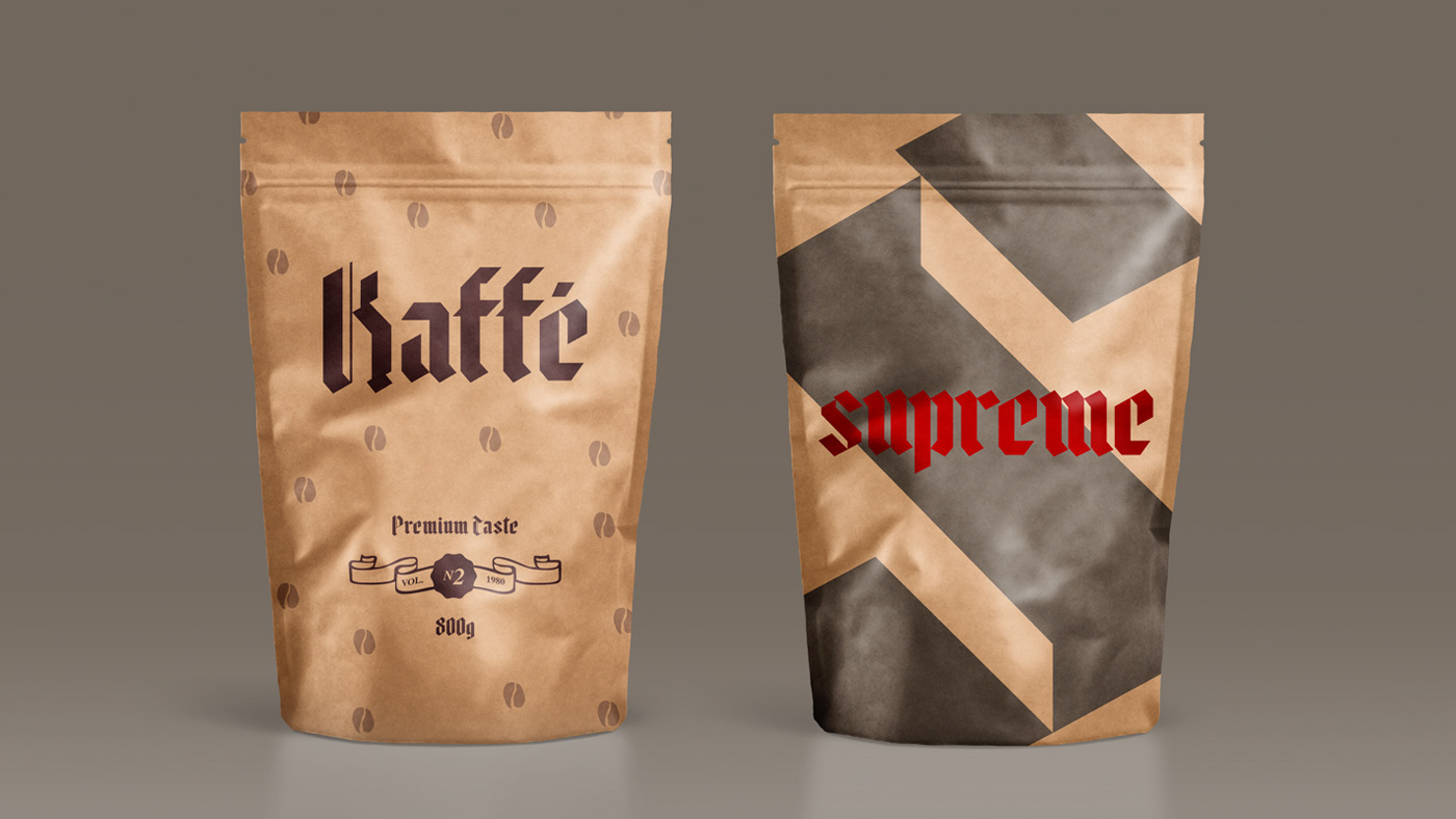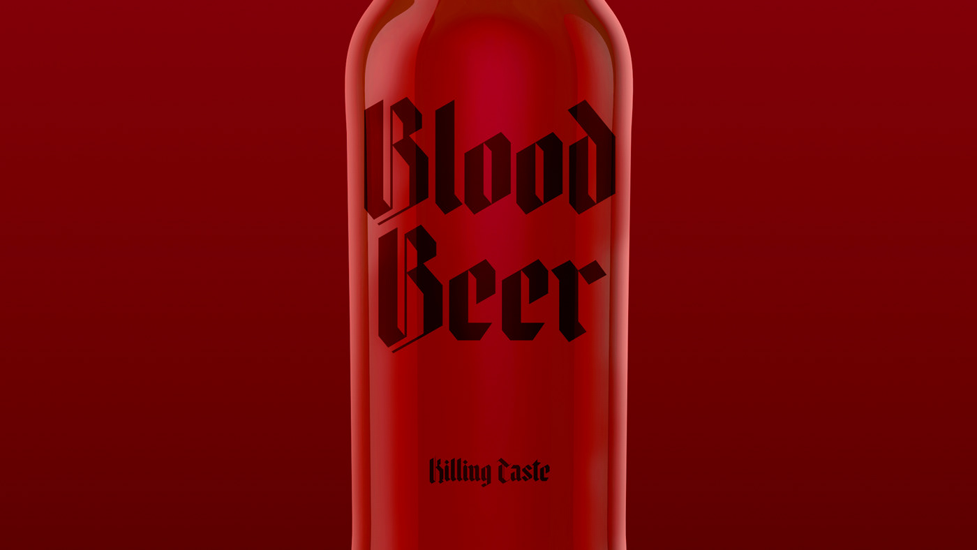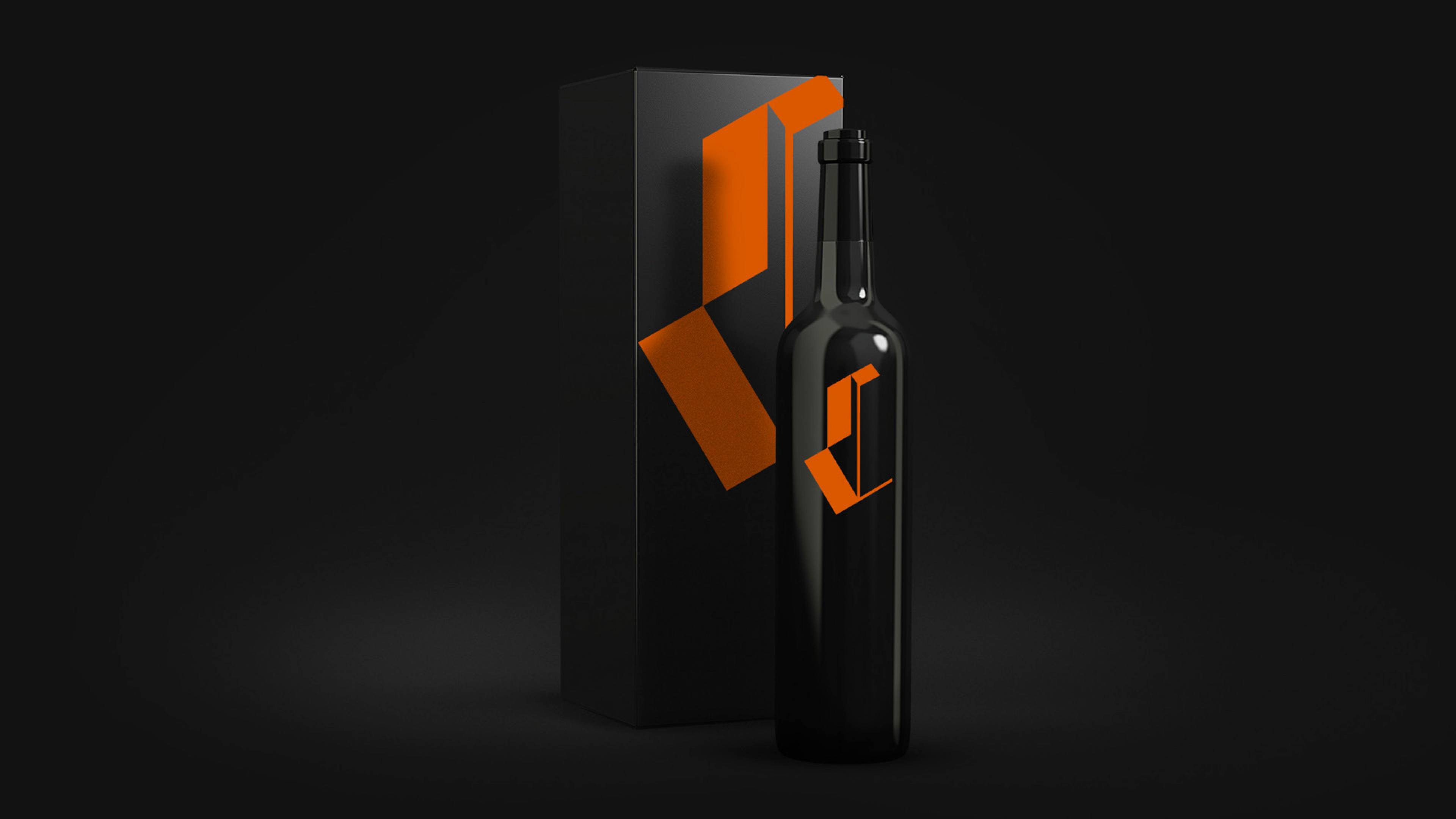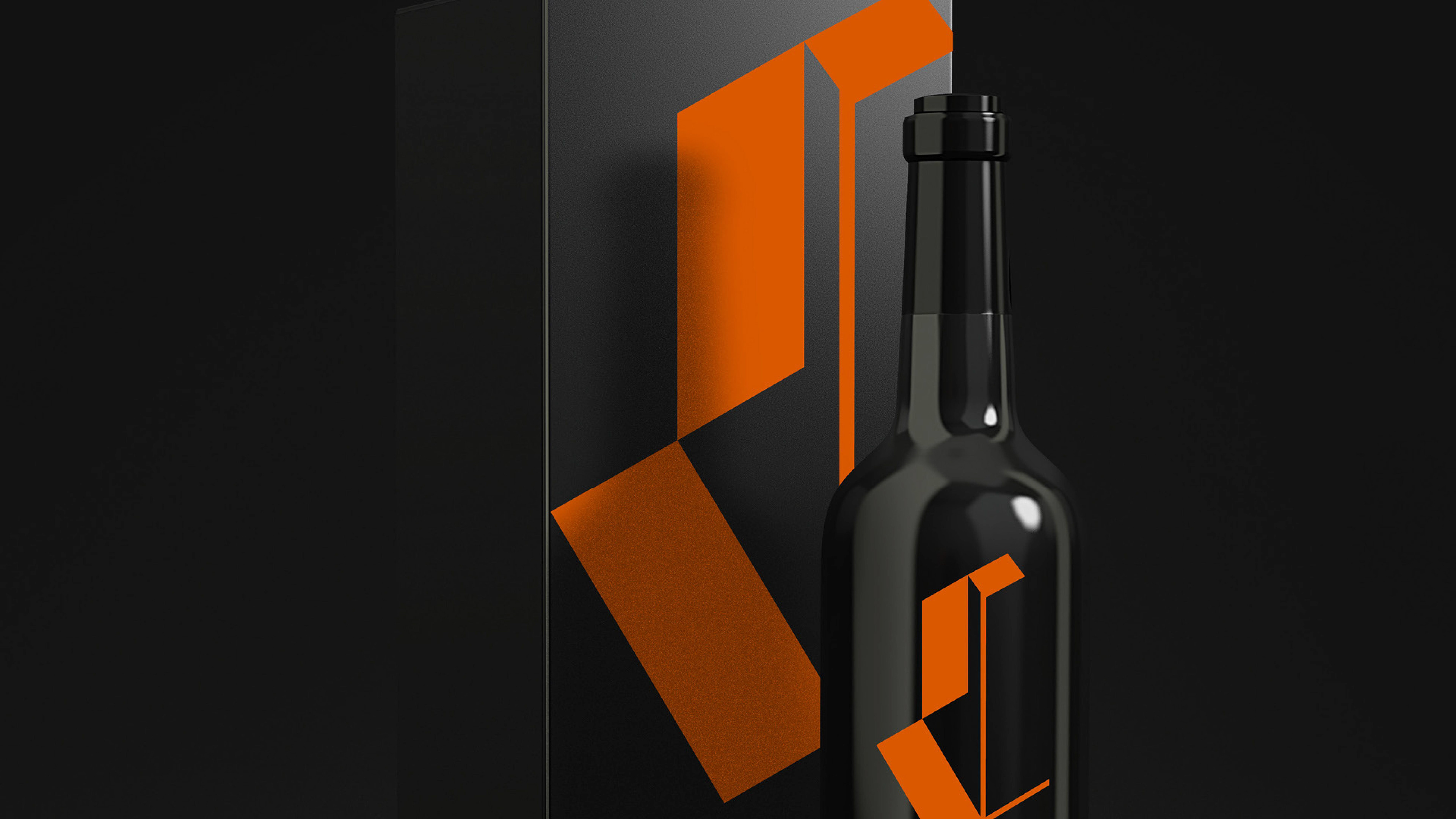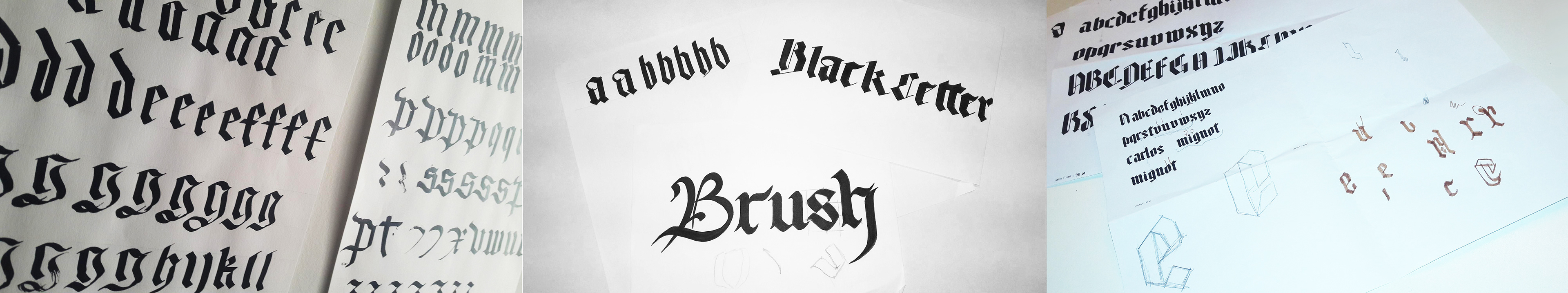
In this TypeFace Design's project for Miami Ad School - Rio, I sought to make a contemporary reinterpretation of Blackletter, a cursive gothic also known as Fraktur. I explored straight angles and geometric lines to simplify the esthetics of the font, but on the chapters I kept their usual ornamentation. Hence arose the Minimal Fraktur - a typeface that uses minimalism to trasmit the majestic and sophisticated concept of their "ancestry".