
Hotel Urbano is Brazil's largest online travel agency (OTA), with 9 million plus sales since the early days of its operation. With a customer service that made it the best in their category, HU is known for its friendly tone. We were invited to redesign their visual identity for the years ahead.
With an established reputation in weekend and leisure trips, they are broadening the scope of offerings to much more than that. This new attitude needed a new visual approach.
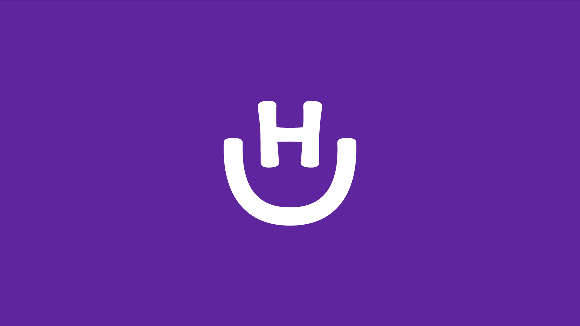
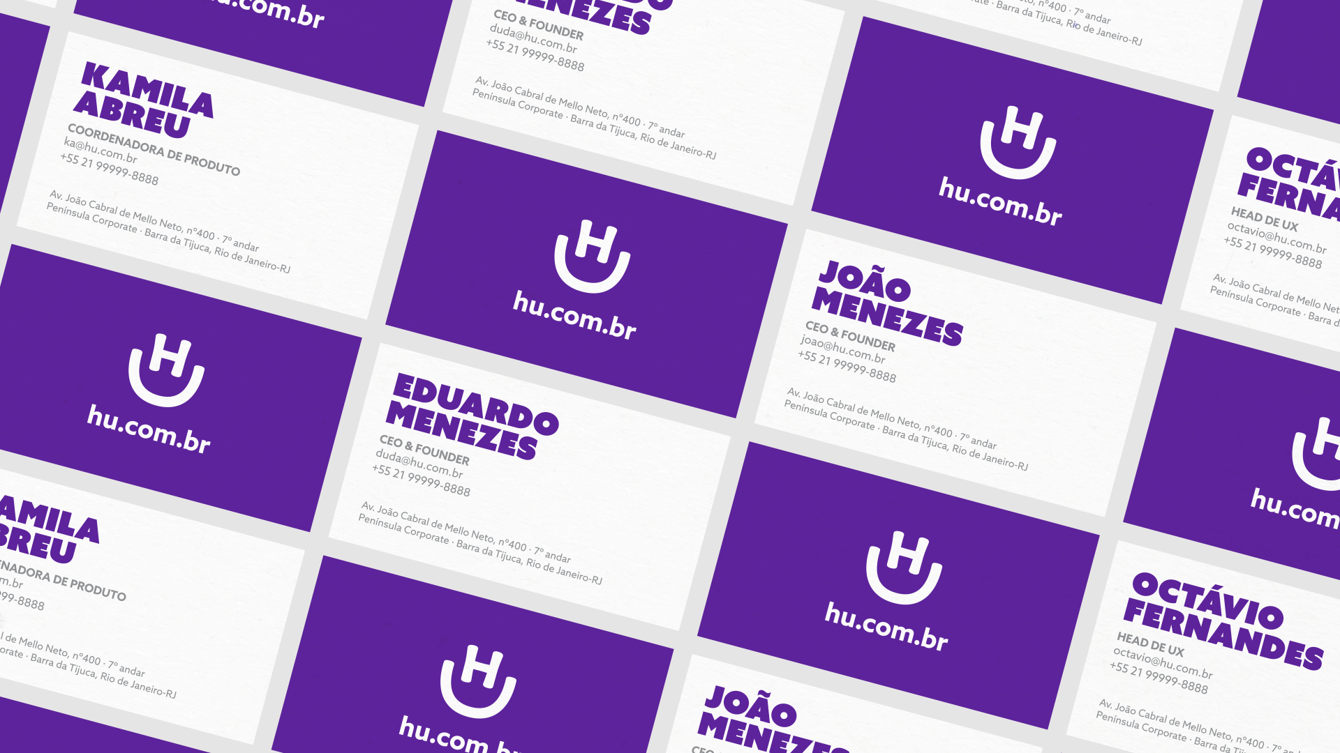
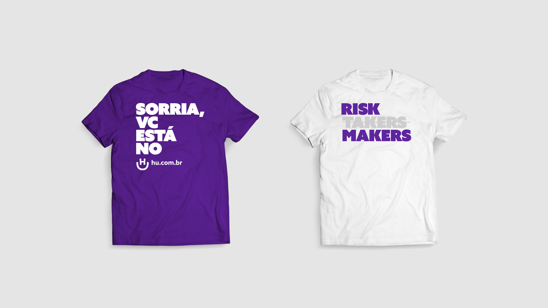
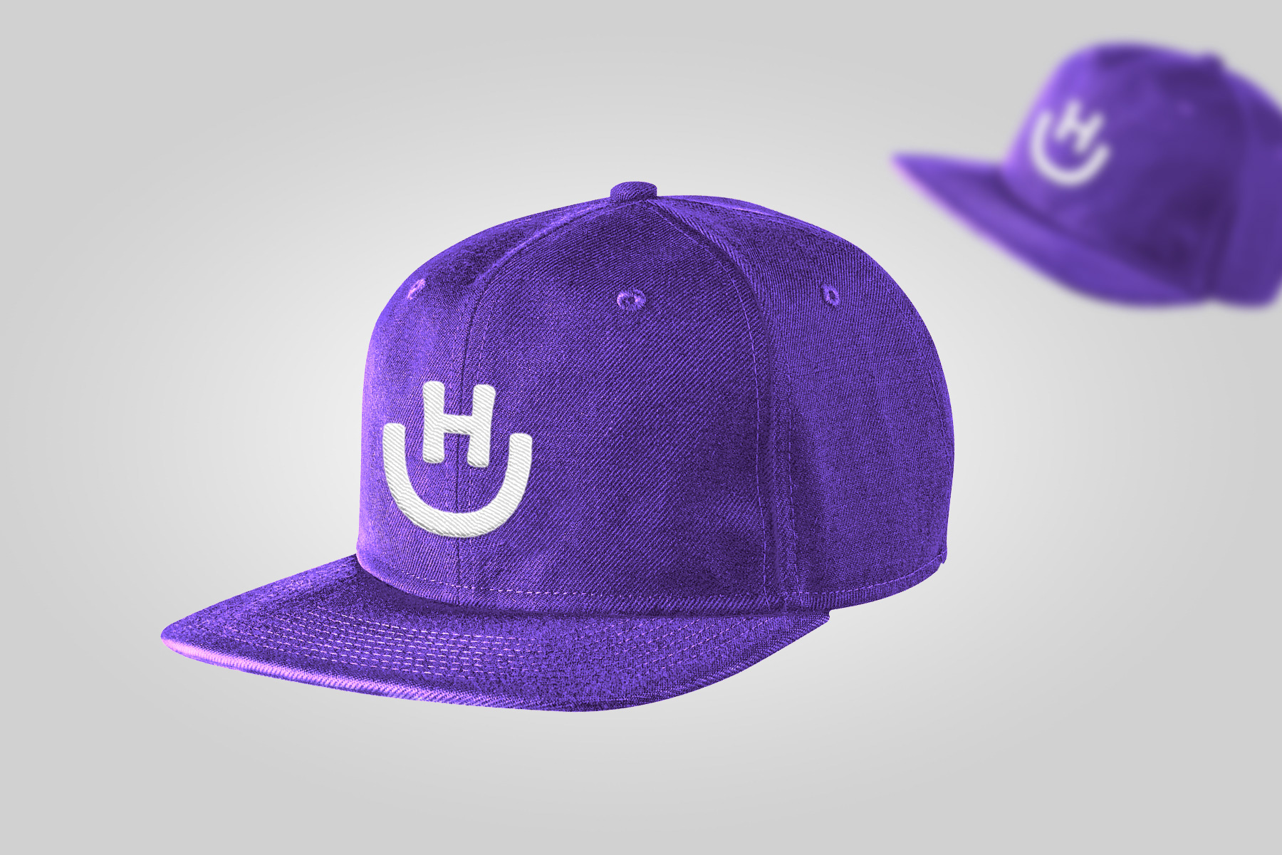
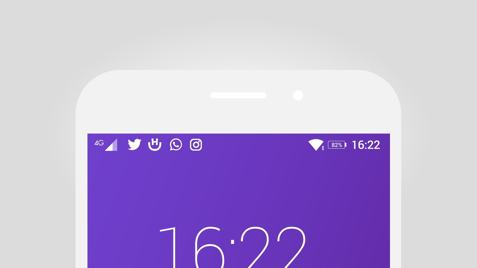
We arrived at the brand idea: "Smile, you're at Hotel Urbano". Starting from the company's initials H & U, we started work on their new symbol. These two letters are symmetric and "hard" letters. From the effort of making them feel friendlier, we came up with the solution, starting with the question: what's your first reaction when you think of travelling?
A smile? Yep, we thought so.
Starting from a smile emoji :), we figured the H could take over the colon and the U, well, the parenthesis is an U in disguise! A 90º rotation and we had it!
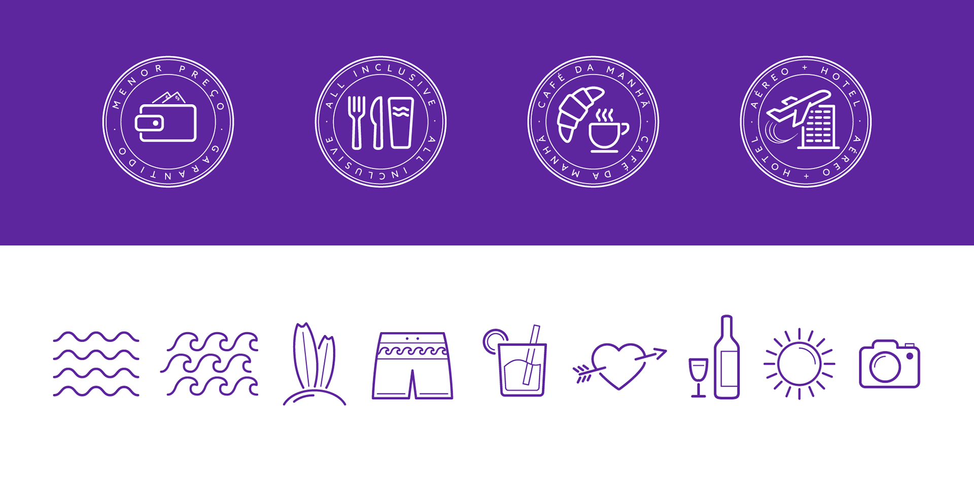
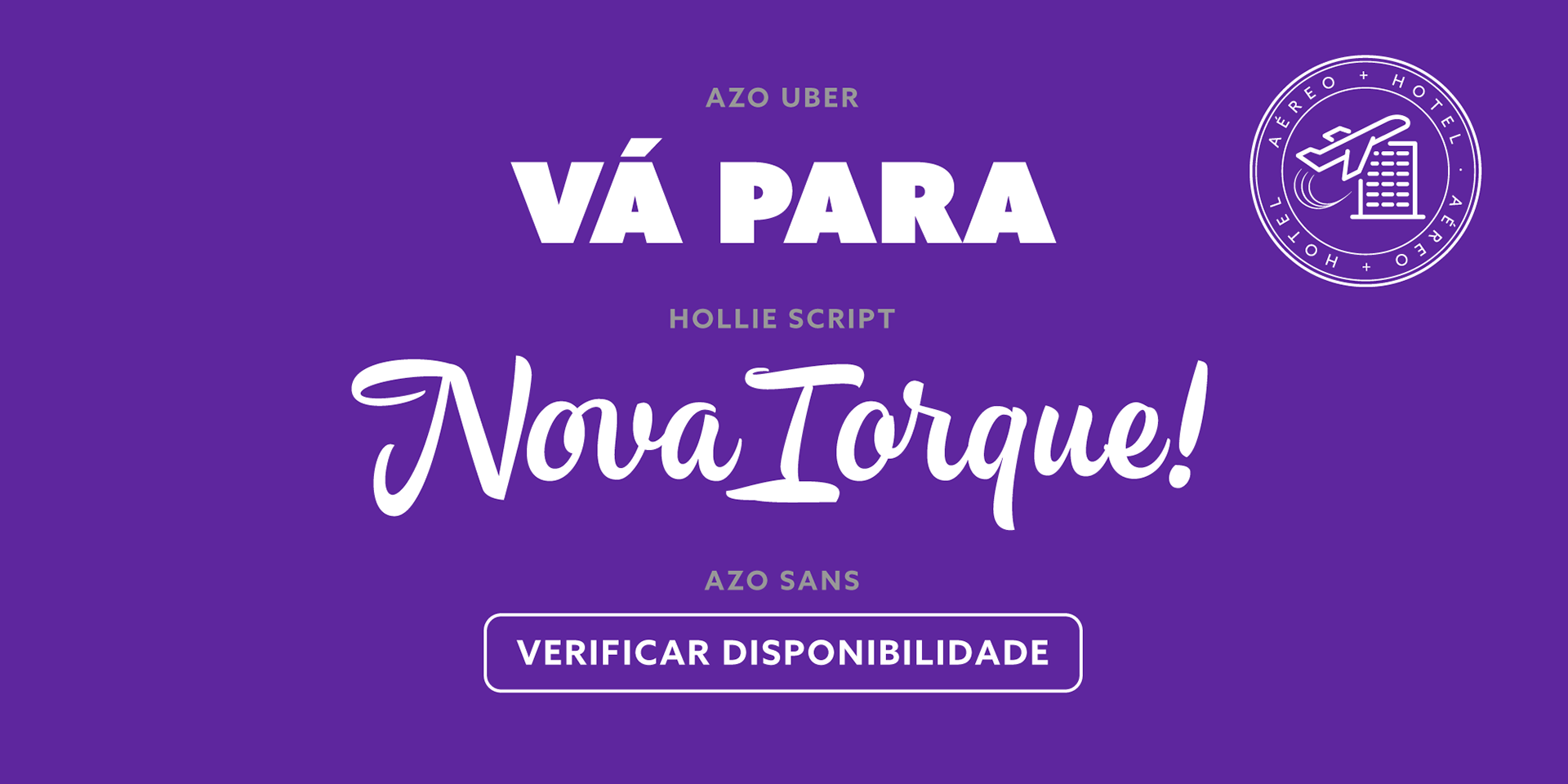
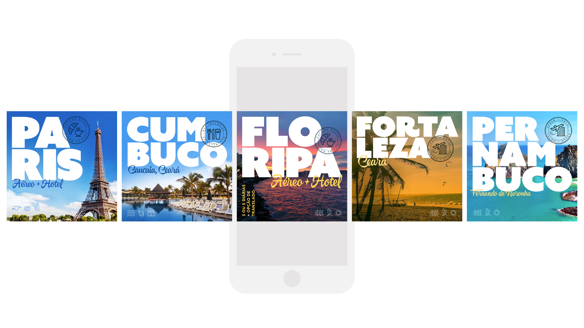
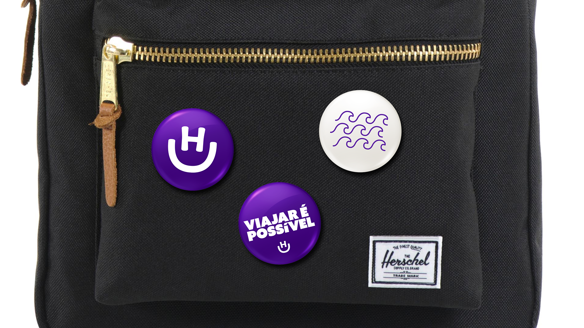
Next, we designed support assets for social media communication, from stamps to specifying support typefaces to unify the brand voice. We chose Azo sans for the text, Hollie Script to set the informal tone and Azo Uber as a bridge between the two.
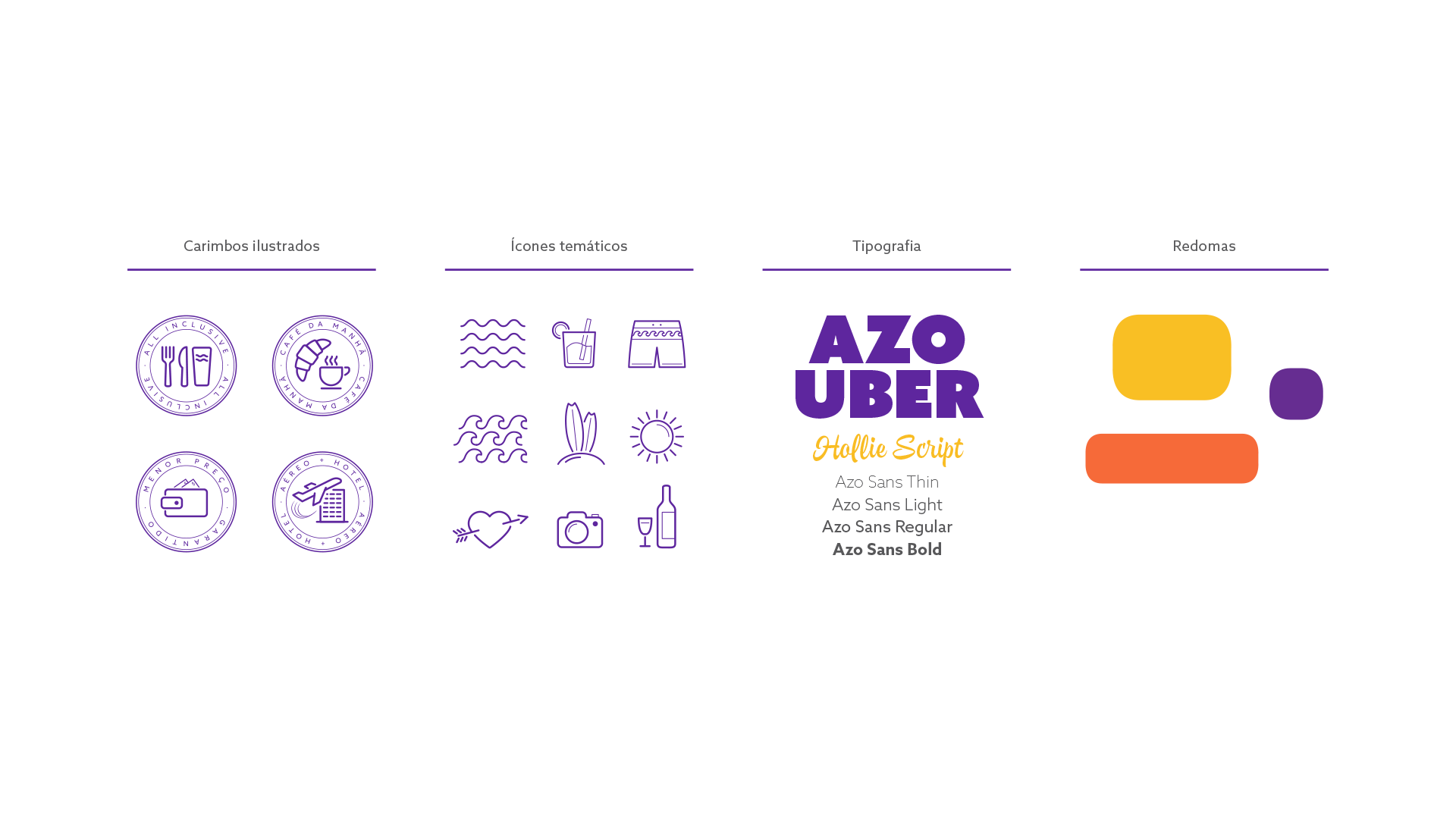
On our study, we found that purple wasn't used by any of their direct competitors, so we suggested they change their blue to something that could be more unique to them.
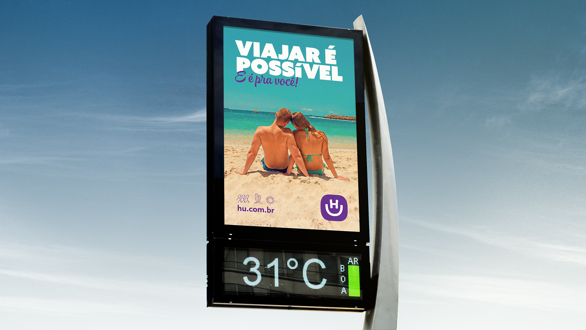
Our brand identity study played an important role in the rollout of their new attitude as a company. We now know that travel in Brazil is written with a smile, caps H and U.
PROJECT CREDITS
Hotel Urbano Team: João Ricardo Mendes, Karyna Accioly et. al.
Creative Director: Rodrigo Saiani
Strategy: Rodrigo Saiani, Ana Laura Ferraz and Flora de Carvalho.
Designers: Rodrigo Saiani, Carlos Mignot, Lucas Campoi, Flora de Carvalho, Ana Laura Ferraz and Felipe Casaprima.
Motion: Raphael Silva
Typefaces: Azo Sans and Azo Uber: Rui Abreu, R-Type. Hollie Script: Felipe Calderón, Estúdio Calderón