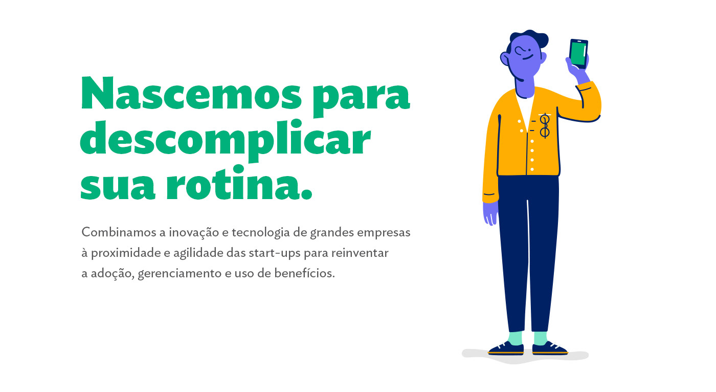
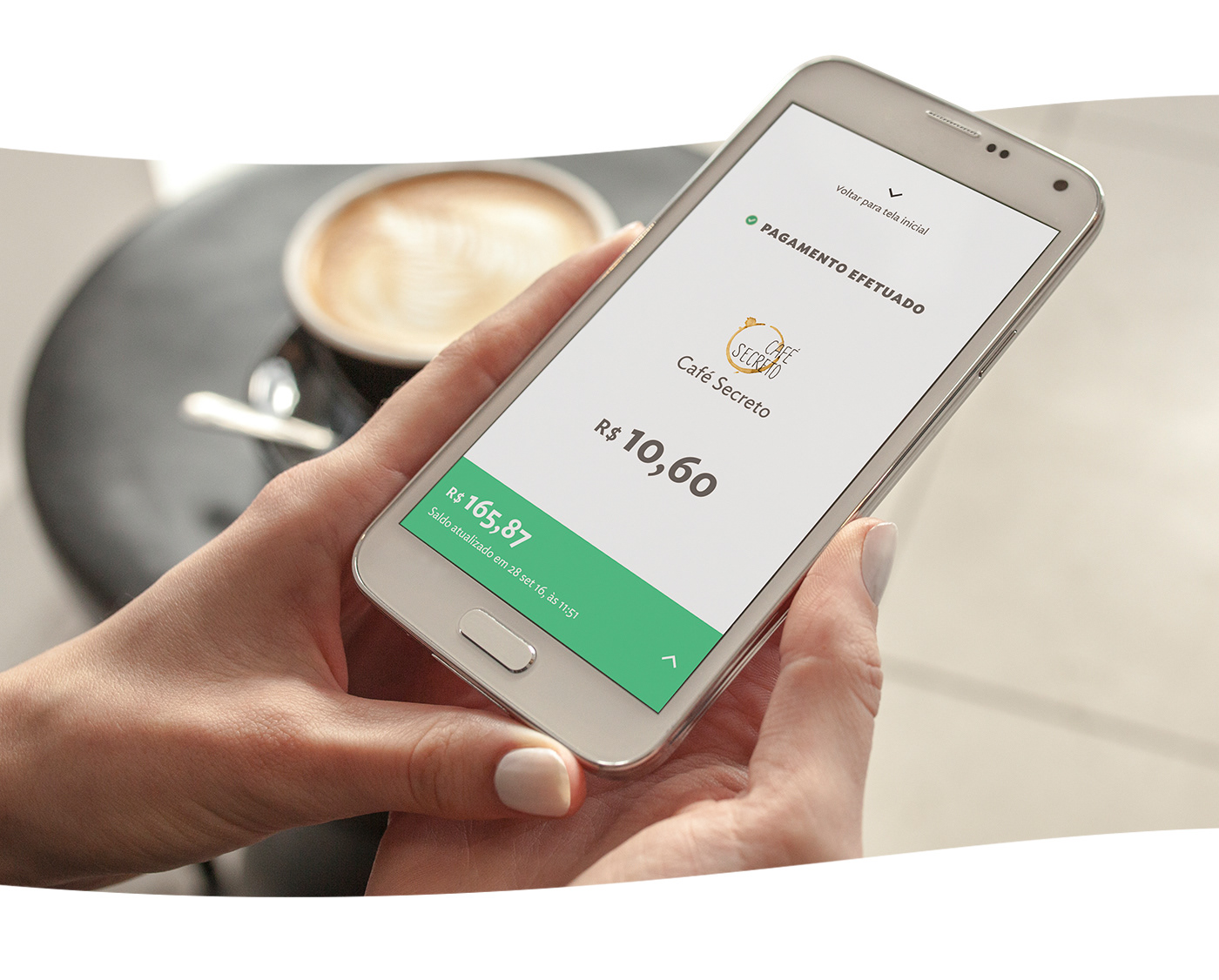
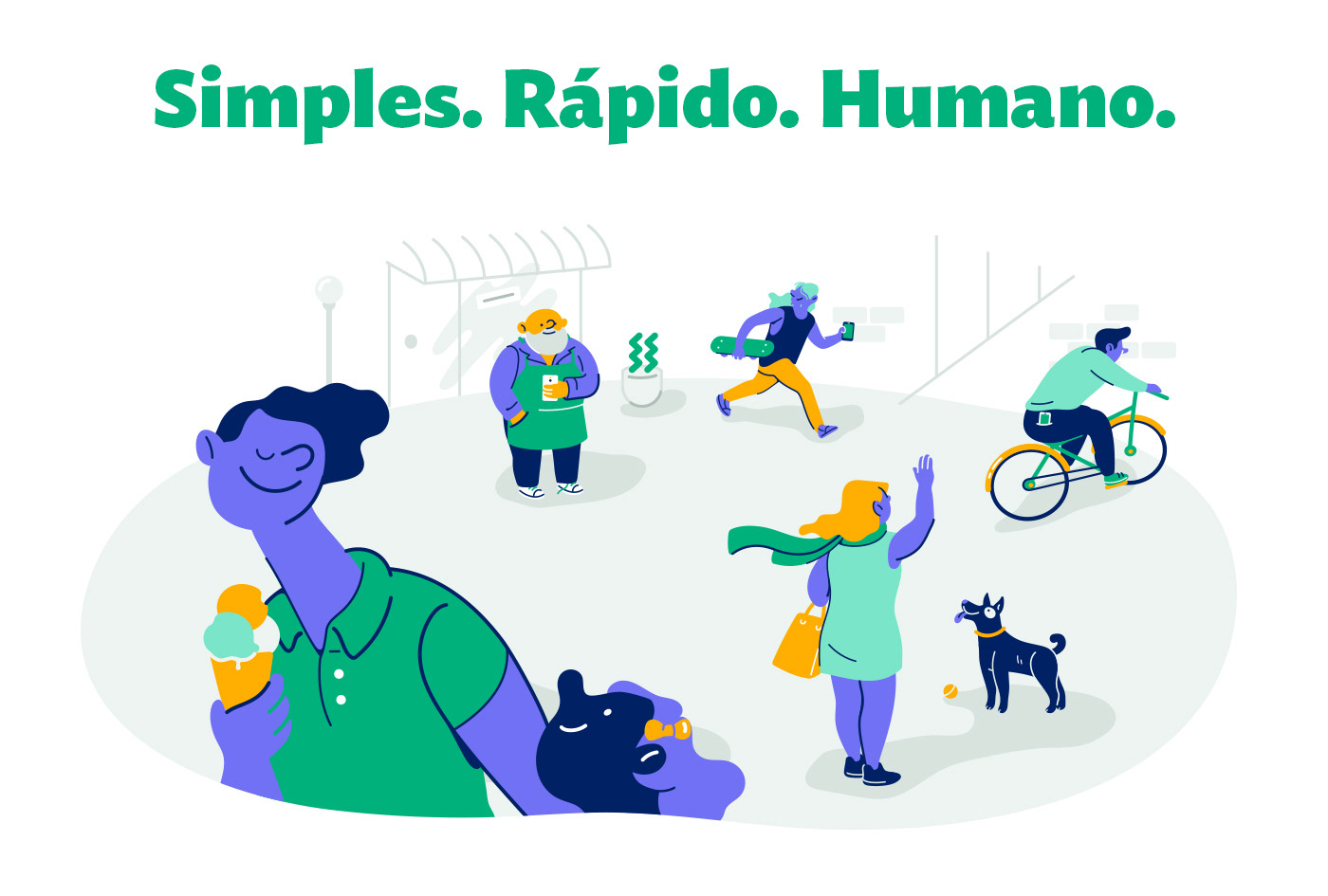
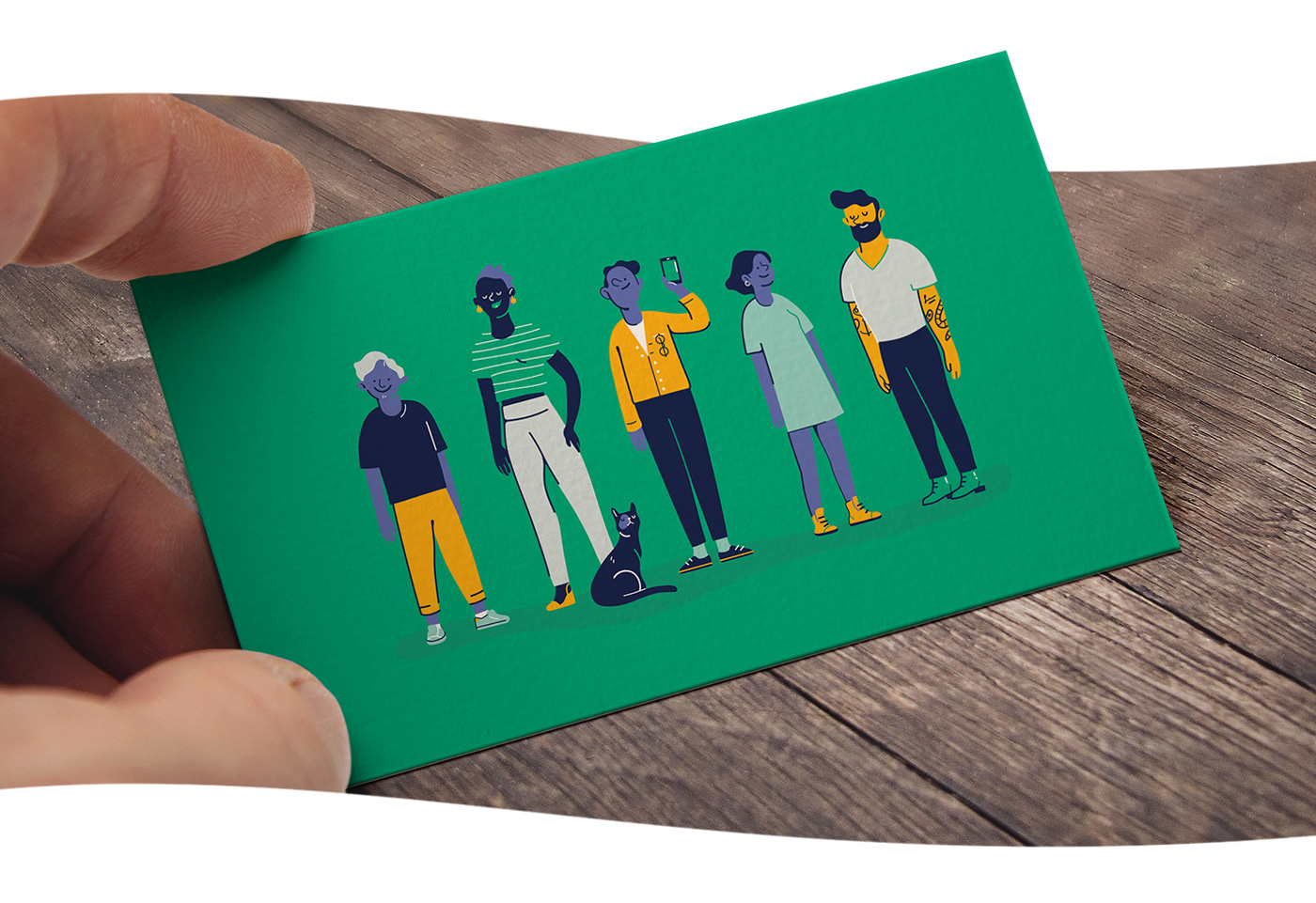
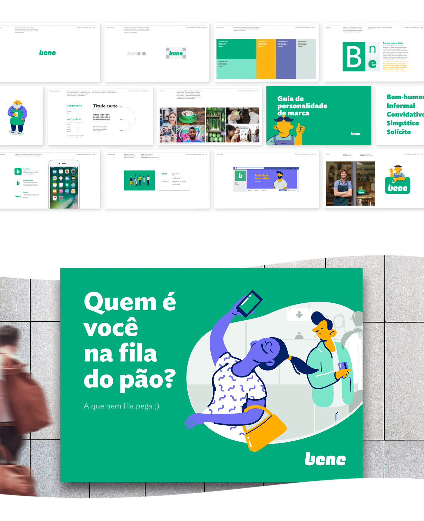
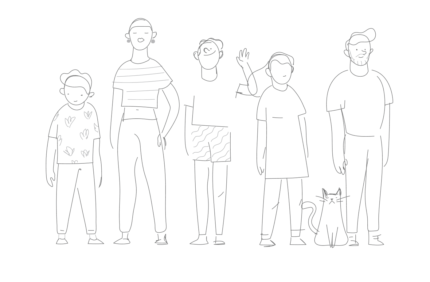
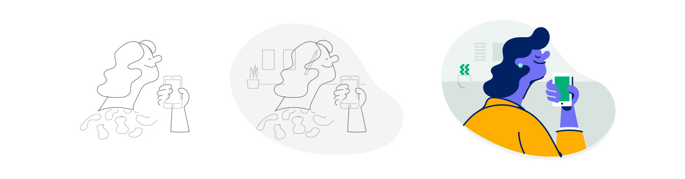

Benefit cards are a big deal for Brazilian workers. They are an important part of a company’s benefit package and up until Bene showed up they were, well, plastic cards. With the brand’s first digital service, paying for a meal is lightning fast and doesn’t depend on third party card reading dongles or gadgets. This also mean lower rates for businesses who use and accept it. We twisted and turned the letters to make them follow the b, a thumbs up sign that is Brazil’s most well known symbol for Ok. It helped that result also comes across as slightly high-tech. We crafted a verbal and visual style that speaks – with a witty, human voice – to the brand’s key audiences: beneficiaries, companies and restaurants. The illustrations were a nice touch to get the point across: not needing to be in a line can make your day much more fun! Bene is growing by the day, and we expect not to need any plastic cards e-v-e-r again real soon. Credits Creative Director: Rodrigo Saiani Designers: Lucas Campoi, Carlos Mignot, Flora de Carvalho Illustrations: Dominique Kronemberger User interface: Lucas Campoi